Apple has hit that elusive textbook-class marketing success. iPhone has the same buzz that Gmail had when Google decided that their Beta product is available only by invitation. iPhone is 6 months away from release but look at the talk around it. Everyone has heard of it now because everyone wants to talk to someone else about it . And everyone is blogging about the iPhone - and here's my two cents on it.
You've heard the comments - it is a gorgeously styled phone but has not much new to offer - it is just slickly packaged and marketed. It is quite possible that the actual product might be fantastic. A lot of the magic is in the User Interface and there is only so much you can say about it - like the Apple iPod. The fact that the click wheel makes a clicking sound (by the small speaker only for it) is best when used and not when you read it. So, final judgements on how great it is can probably only be passed once the product comes out. It does look very nice.
So, what is this blog about - just a couple of points about the UI from the demos I saw on the apple site.
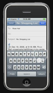
Take a look at this screen - I know the iPhone does not have a keyboard and provides a software keyboard which you can use like a regular one. That is a fine idea but look at the keyboard.
What I don't like about it is that although it is a QWERTY keyboard it does not have a full keyboard - the digits and symbols have to be accessed much like an old phone which had menu options for 123, Symbols, etc. Unfortunate.
 The next thing that strikes me is that there is not enough space to see or read what is on the screen after the keyboard pops up - most of the screen is taken up by the keyboard and the effective space is down to a couple of lines. My age-old phone has more space than that. My wife's Blackberry (left - I couldn't capture a better image of email and keyboard together - it isn't meant to be Blackberry marketing! :), despite its not so good-looks, has a practical amount of screen real-estate. Definitely a win for the Blackberry here. Usually, phones in this category support hand-writing recognition using a stylus which allows them to provide larger screen estate without the keyboard in the way or they do it the Blackberry way. With no stylus the iPhone loses space.
This is the SMS screen (right). Looks cute but if the demo follows the product faithfully the ordering of messages seems wrong. I believe it should be in reverse chronological order so that the most relevant messages (the recent ones) are on top versus having to scroll down. Also, this is perhaps the most wasteful of screen layout designs - nice but wasteful. Hardly a good idea considering how little of it you have. But then perhaps these are just preferences that you can set - like Google Talk.
 What I like is the interface you get when you are in a call. The large buttons that come up for Speaker, Mute, Hold, etc are excellent for usability. I have the hardest time figuring out which button is which on my phone and even on the Blackberry you have to know what button does what - this is so much more elegant and usable.
All said, the Apple iPhone is definitely going to be a serious contender in the phone market and like in the case of music players might cause the other competition to provide a host of new features. Most people have predicted that the iPhone will not have the same impact that iPod did - which is probably very easy to predict because the phone market is quite mature and a tie in to a service provide (Cingular) restricts the user-base but I still expect the iPhone to make quite an impact. Whether the Blackberry users switch - can't say - those things are quite addictive.
The overall iPhone UI theme is large, informal text which looks aesthetically pleasing and is very readable but wastes space. In contrast, business phones like the Blackberry are all business-like keeping everything to efficient levels while compromising on looks, jazz and style.
Btw, I wonder if I am the only one who finds QWERTY keyboards a strange feature on mobile phones when people type with their thumbs. So quickly now - Where is the D key, the P key, or the N key, the X key - can you answer without looking at the keyboard? For people who can type with all fingers it is quite useless because the fingers keep the memory of the letters they type and not the thumbs (in fact the thumb only knows the space key) and definitely not the eyes so they have to hunt for the letters. For people who can't type and look at the keys when they type, I wonder if they do they find QWERTY layout any easier than a ABCDEF layout? Seems to me that for either group the ABCDEF layout makes more sense than having to hunt the entire screen.