Thursday, August 02, 2007

Rising to the top

Recently, I posted a one line, grammatically incorrect (actually it just had a typo - a missing 'of') blog in which all I did was praise Seth Godin's article and point to it. I didn't think anything I had to say about the topic could really add any additional value so I refrained from putting in any of my comments. I didn't think much about it then but afterwards I found out, interestingly, this article had reached the top of the Popular Entries for the last 24 hours at JavaBlogs.com. This is not really such a big deal but I have an RSS feed to the popular entries and it is always interesting to see what rises to the top in that list. Because Mozilla's Live Bookmarks shows only the title, I have to judge whether I want to read the article based on the title.

Despite it being a collection of Java blogs, it is infrequent that anything seriously technical about Java manages to hold popular attention. It is always the more interestingly worded title that starts to move up rapidly (perhaps the only exceptions are the latest buzzwords and the word 'performance'). More technical titles generally languish somewhere in the middle of the list which at the top is crowded by articles that are inflammatory in their title or simply very vague about their content. The advantage of the latter (which mine must've inadvertently become) is that you have to click on the link to find out what's in the blog. This makes the blog more 'popular'. This, of course, makes it go up higher in the list allowing reaching more people and setting off a chain reaction.

So, here's (deliberately this time) a rather vague title for this blog to test this theory :-)

Tuesday, July 31, 2007

Managing Expectations

Seth Godin has this truly wonderful blog which is always very interesting to read and this piece advice is true gold.

Wednesday, July 18, 2007

Another reason to have X-GOOGLE-TOKEN?

In my previous post here about XMPP I had linked to a blog (here) that describes the X-GOOGLE-TOKEN mechanism of authentication. dJOEk asks a question "Why does Google use a proprietary authentication mechanism" and then goes on to make a point about how X-GOOGLE-TOKEN could be one of the first steps twoards a Single Sign On solution from Google. This point of view has received a lot of coverage with a several people commenting about the merits of this idea or its feasibility.

I have recently noticed another possible reason for X-GOOGLE-TOKEN to be made available and this is what I am putting forth here -
I had written in my blog that when I tried to sniff out the conversation between Google Talk and the server using Ethereal I found that it was using TLS and not X-GOOGLE-TOKEN and therefore all conversation was encrypted. Several people have since asked for ways around this but the whole point of TLS is to prevent such sniffing and decryption is practically (at least to me) impossible.

Since then my current company has installed an auditing software (I know :-() for compliance reasons and interestingly Google Talk is back to using X-GOOGLE-TOKEN. When using X-GOOGLE-TOKEN only the authentication part goes over TLS while the rest of the conversation does not which means that conversations are in plain text and can be intercepted, audited and archived. So, another possible reason for supporting a different authentication mechanism could be to be able to support auditing and monitoring software?

Friday, June 29, 2007

Progress job posting on Joel India Jobs Board

Joel from JoelOnSoftware has this jobs board specific to India jobs which we are trying for the first time. The idea is that we will either get a bunch of resumes from the kind of people we like to hire or hear from or we will not get anything at all. Our usual experience from recruitment agencies and job sites like Monster is that we get a lot of resumes (with less than 10 percent being the ones we seriously consider and interview) and sifting through them just kills us.

Here's the link to the job post http://jobs.joelonsoftware.com/?2202

I would love to hear from people who have tried the Joel India Jobs Board and hear their experiences. If this works for us we'll do more job posts here.

This is the text of the job post -

Software Engineer

at Progress Software

Hyderabad, India

We are a small and focussed engineering team in Hyderabad developing the next wave of SOA development tools for our product, the Sonic Enterprise Service Bus. We have been involved in writing Eclipse based high-end editor plug-ins for open standards based technologies such as XML, XPath, WSDL, etc using a variety of Eclipse frameworks such as EMF, GEF, etc. We have developed code generators and graphical tools for generic mapping capabilities, developing BPEL, etc, amongst many others.

We are looking for smart and competent people to join and enhance the experience of SOA development for our users. The next few releases are going to be very exciting as we add features to improve developer productivity, including refactoring distributed applications, visual development, and on-line assistants.

We are looking for excellent programmers in Java with up to 3 years in experience who also possess these qualities -
Creativity - we like people who can think of new features for our products and make a difference to our users
Capability - we want people who are very good at programming and can demonstrate it to us
Self-driven - we are self-driven people who are expected to work with minimal supervision and get things done

Any in-depth Swing or Eclipse development experience is a plus but not a requirement.

The team is completely based out of Hyderabad and has a QA to developer ratio of over 1-to-1. We participate in local college internship programs and in various forums.

Comments about the Joel Test: We fix all test blockers before we write new code. The "quiet working conditions" implies offices as per the Joel Test - we have workspaces and we like to mingle and have some fun.


Our interview process is heavily biased towards programming skills so please apply only if you are serious and think of yourself to be an excellent programmer.

Joel Test Score: 11/12

The Joel Test is a twelve-question measure of the quality of a software team.

Yes! Do you use source control?
Yes! Can you make a build in one step?
Yes! Do you make daily builds?
Yes! Do you have a bug database?
Yes! Do you fix bugs before writing new code?
Yes! Do you have an up-to-date schedule?
Yes! Do you have a spec?
No. Do programmers have quiet working conditions?
Yes! Do you use the best tools money can buy?
Yes! Do you have testers?
Yes! Do new candidates write code during their interview?
Yes! Do you do hallway usability testing?

Interested?

If working with a small, focussed, informal team that is completely engaged in every aspect of product development starting from product direction and requirements gathering to engineering excites you then send us your resume at joeljobs@progress.com

Friday, March 09, 2007

Who cares about the chronological ordering of blogs?

There is a new way of designing blogs at Blogger and in general it is very easy - point and click, move around, group - the usual goodies associated with good Web-UI these days. The new blogger re-design also has a different mechanism of listing previous posts. They now group it by chronological order. I have spent some time trying to understand why this is useful to people who come to my site? And I have been completely defeated in understanding its purpose. Before I go into a litany of my issues with this new way of organizing posts I want to show what I mean -

This is the old way it used to be -

And this is the new format (which you can see in the right pane of this page if you are at the original blog site and not seeing this through a reader) -

I don't see why this useful for anyone other the blog author - and even for the author it is only informative (ah February 2007 was a good month for me - Oh Gosh! I didn't post a single thing between October 2005 and August 2006).

Here's what is lost by going to this format -
a. Earlier visitors (especially first-time visitors which are the majority of the visitors according to Statcounter's indication of the abysmal popularity of this blog :-)) cannot see a quick list of other posts which might catch their attention. They now have to do a deliberate task of expanding those date nodes to see what I might have written previously. I might just stop putting in titles altogether.
b. And really what is the reason to group it by month or date - do any of my readers really relate to the dates that I published my articles? How is August 2006 any more important than Jan 2007?

I am sure that there is way somewhere to hack out of it and maybe I'll have to sit down and hunt for it. I searched for it in the options and could not find a way to switch this off.

Monday, February 26, 2007

Accepting the Q factor

http://www.w3.org/2000/09/xmldsig# is the namespace for the schema for XML Signatures - one of the many, many schemas you end up accessing if you do XML Schema based completion for WS-SecurityPolicy (2005) (part of our WSDL policy editor in the Eclipse plugins for Sonic ESB Workbench). Why is this one special? For the following reason -

If you access http://www.w3.org/2000/09/xmldsig# from Mozilla Firefox you will get back the schema at http://www.w3.org/TR/2002/REC-xmldsig-core-20020212/xmldsig-core-schema.xsd (through an HTTP re-direct response code 303) but if you use Java's java.net.URL.openConnection() (basically through HttpURLConnection) you get an HTML page and not the Schema (XML) which our Schema loader does not particularly appreciate.

It took a while for me to understand why the same URL is behaving differently. Using Eclipse 's TCP/IP Monitor I captured the headers sent by my code and used LiveHTTPHeaders for Firefox.

This is what Firefox sends -

GET /2000/09/xmldsig HTTP/1.1
Host: www.w3.org
User-Agent: Mozilla/5.0 (Windows; U; Windows NT 5.1; en-US; rv:1.8.1.2) Gecko/20070219 Firefox/2.0.0.2
Accept: text/xml,application/xml,application/xhtml+xml,text/html;q=0.9,text/plain;q=0.8,image/png,*/*;q=0.5
Accept-Language: en-us,en;q=0.5
Accept-Encoding: gzip,deflate
Accept-Charset: ISO-8859-1,utf-8;q=0.7,*;q=0.7
Keep-Alive: 300
Connection: keep-alive

and this is what it receives -

HTTP/1.x 303 See Other
Date: Mon, 26 Feb 2007 11:50:20 GMT
Server: Apache/1.3.37 (Unix) PHP/4.4.5
WWW-Authenticate: Basic realm="W3CACL"
Location: http://www.w3.org/TR/2002/REC-xmldsig-core-20020212/xmldsig-core-schema.xsd
Keep-Alive: timeout=2, max=99
Connection: Keep-Alive
Transfer-Encoding: chunked
Content-Type: text/html; charset=iso-8859-1


But when HttpURLConnection sends the request this is what it sends -

GET /2000/09/xmldsig HTTP/1.1
User-Agent: Java/1.4.2_12
Host: www.w3.org
Accept: text/html, image/gif, image/jpeg, *; q=.2, */*; q=.2
Connection: keep-alive


and this is what it receives -

HTTP/1.1 303 See Other
Date: Mon, 26 Feb 2007 11:56:47 GMT
Server: Apache/1.3.37 (Unix) PHP/4.4.5
WWW-Authenticate: Basic realm="W3CACL"
Location: http://www.w3.org/TR/2002/REC-xmldsig-core-20020212/Overview.html
Keep-Alive: timeout=2, max=99
Connection: Keep-Alive
Transfer-Encoding: chunked
Content-Type: text/html; charset=iso-8859-1


Notice the difference in the Location header
Firefox : Location: http://www.w3.org/TR/2002/REC-xmldsig-core-20020212/xmldsig-core-schema.xsd
Java URLConnection : Location: http://www.w3.org/TR/2002/REC-xmldsig-core-20020212/Overview.html

The problem turns out to be in the Accept header set by Java URLConnection by default (or I guess the Sun HttpURLConnection implementation).

Accept: text/html, image/gif, image/jpeg, *; q=.2, */*; q=.2


Note no text/xml as in Firefox. Although there is a */* its 'q' value is lower than text/html and the nice server at www.w3.org uses this to change its output to suit what is best accepted by the user-agent. I guess since they are the standards organization they should do this :-). Fixing the accept header fixes this behaviour. Is there something I am missing in my understanding of how URLConnection works?

Saturday, February 24, 2007

Experiments with development on the Nokia 6265

I recently got myself the Nokia 6265 CDMA phone. It is a nice phone and I intend to write a reveiw of it in my other blog one of these days. The phone supports the Nokia's Series 40 3rd Edition development platform and I am trying out developing Java Micro Edition applications for it. I hit some interesting problems and found some solutions - I am trying to chronicle them here.

Firstly, I have never done development for a mobile phone so I had to start from scratch. I wanted to know what I could do with my phone and Nokia had quite a lot of information. They have these videos of their Eclipse integration called Carbide.j which seemed interesting although a little painful (being a graphical modeling like UI and all).

I found the Nokia site a tad vague about what exactly is needed for what but eventually I figured I needed the Nokia Series 40 3rd Edition SDK. Now, Nokia has 3rd Edition Feature Pack 1 and 3rd Edition Feature Pack 2. It wasn't very clear to me which one would work and I chose the base version and thankfully that is the right one. Only one phone so far supports Feature pack 1 as far as I know.

After installing the SDK, the documentation said that I need a JDK, Eclipse, NDS for Java ME, and then I should install SDK. Did I mention that the Nokia site is slightly confusing? :-) I went off in search for NDS and found out that it is now renamed to Carbide.j and is a 135+ MB download. While it was downloading, I thought I would try and locate J2ME support in IntelliJ Idea.

IntelliJ Idea J2ME integration

Now, this is the nice part.

I went through the IntelliJ Idea documentation which described how to set up a J2ME module and the only part that looked a little hard was the Mobile JDK configuration. I crossed my fingers and pointed at the Nokia installation and IntelliJ found all it needed - bootclasspath, javadocs, emulator, etc. It is really sweet!!

Everything works out of the box - compile works great, and when you run it runs against the Nokia emulator. Even debugging is seamlessly supported!! Fantastic - and no need for Eclipse or the Eclipse plugins! Needless to say I cancelled my Carbide.j download. You do not need it for development on the Nokia phones. I hope the Nokia guys put this on their documentation.

One strange problem so far (in my HelloWorld application) has been that the jad and jar generated by IntelliJ is not working on my phone or on the emulator. It fails with an error message saying "Application invalid. Delete?". There is a temporary file that Idea is generating which seems to work. I think I am missing something here. I would appreciate any help.


Annoying UI Change in Firefox 2.0

Firefox 2.0 is out and I upgraded from 1.5.x to 2.0. While closing a tab I realized something was amiss. In 1.5.0 there are two ways to close a tab - each tab is associated with a close button and the tab bar has a close button at its extreme right which is applicable to the most active tab. That is the button I use the most and that is gone from 2.0.


Why do I think this is an annoying change? The old button on the right of the task bar never moved - which meant irrespective of which tab I was on I could aim my mouse over it (a centimeter square area that my hand and wrist manage to reach magically) and close without having to think too much about it. Now, I have to look for the close button and my target has just expanded horizontally to unpredictably include my entire horizontal resolution. Another reason was I could close many consecutive windows one after the other just pressing the button multiple times because the selection automatically moves to the next tab. No longer possible. Arghhh! Hopefully there is a preference somewhere which can get it back - but so far I haven't found it. In its place there is a drop down of all windows to quickly navigate to it.

Well...sigh...I still love Firefox and I'll just use Ctrl+F4 more frequently...

Sunday, January 14, 2007

What I don't like about the iPhone

Apple has hit that elusive textbook-class marketing success. iPhone has the same buzz that Gmail had when Google decided that their Beta product is available only by invitation. iPhone is 6 months away from release but look at the talk around it. Everyone has heard of it now because everyone wants to talk to someone else about it . And everyone is blogging about the iPhone - and here's my two cents on it.

You've heard the comments - it is a gorgeously styled phone but has not much new to offer - it is just slickly packaged and marketed. It is quite possible that the actual product might be fantastic. A lot of the magic is in the User Interface and there is only so much you can say about it - like the Apple iPod. The fact that the click wheel makes a clicking sound (by the small speaker only for it) is best when used and not when you read it. So, final judgements on how great it is can probably only be passed once the product comes out. It does look very nice.


So, what is this blog about - just a couple of points about the UI from the demos I saw on the apple site.

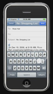
Take a look at this screen - I know the iPhone does not have a keyboard and provides a software keyboard which you can use like a regular one. That is a fine idea but look at the keyboard.

What I don't like about it is that although it is a QWERTY keyboard it does not have a full keyboard - the digits and symbols have to be accessed much like an old phone which had menu options for 123, Symbols, etc. Unfortunate.

Blackberry keyboard and screen togetherThe next thing that strikes me is that there is not enough space to see or read what is on the screen after the keyboard pops up - most of the screen is taken up by the keyboard and the effective space is down to a couple of lines. My age-old phone has more space than that. My wife's Blackberry (left - I couldn't capture a better image of email and keyboard together - it isn't meant to be Blackberry marketing! :), despite its not so good-looks, has a practical amount of screen real-estate. Definitely a win for the Blackberry here. Usually, phones in this category support hand-writing recognition using a stylus which allows them to provide larger screen estate without the keyboard in the way or they do it the Blackberry way. With no stylus the iPhone loses space.

This is the SMS screen (right). Looks cute but if the demo follows the product faithfully the ordering of messages seems wrong. I believe it should be in reverse chronological order so that the most relevant messages (the recent ones) are on top versus having to scroll down. Also, this is perhaps the most wasteful of screen layout designs - nice but wasteful. Hardly a good idea considering how little of it you have. But then perhaps these are just preferences that you can set - like Google Talk.

What I like is the interface you get when you are in a call. The large buttons that come up for Speaker, Mute, Hold, etc are excellent for usability. I have the hardest time figuring out which button is which on my phone and even on the Blackberry you have to know what button does what - this is so much more elegant and usable.

All said, the Apple iPhone is definitely going to be a serious contender in the phone market and like in the case of music players might cause the other competition to provide a host of new features. Most people have predicted that the iPhone will not have the same impact that iPod did - which is probably very easy to predict because the phone market is quite mature and a tie in to a service provide (Cingular) restricts the user-base but I still expect the iPhone to make quite an impact. Whether the Blackberry users switch - can't say - those things are quite addictive.

The overall iPhone UI theme is large, informal text which looks aesthetically pleasing and is very readable but wastes space. In contrast, business phones like the Blackberry are all business-like keeping everything to efficient levels while compromising on looks, jazz and style.

Btw, I wonder if I am the only one who finds QWERTY keyboards a strange feature on mobile phones when people type with their thumbs. So quickly now - Where is the D key, the P key, or the N key, the X key - can you answer without looking at the keyboard? For people who can type with all fingers it is quite useless because the fingers keep the memory of the letters they type and not the thumbs (in fact the thumb only knows the space key) and definitely not the eyes so they have to hunt for the letters. For people who can't type and look at the keys when they type, I wonder if they do they find QWERTY layout any easier than a ABCDEF layout? Seems to me that for either group the ABCDEF layout makes more sense than having to hunt the entire screen.